
.svg)

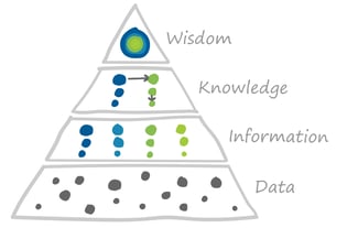
Data ≠ information
Although we often use the terms interchangeably, there is a difference between data and information.
Data is the raw recording of anything and everything that can be observed – locations, prices, temperatures, re-tweets, weights, expenditures. It’s meaningless until it is processed and organized. Like drinking from the proverbial firehose, data can be overwhelming. If you’ve ever looked at a large, unorganized spreadsheet, you might have had this feeling.
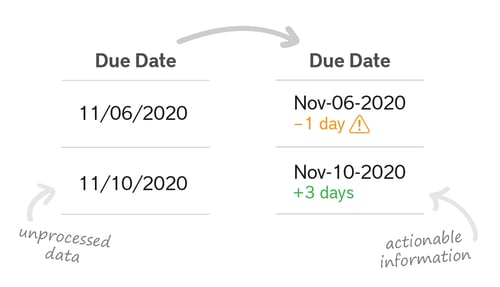
Imagine you’ve been sent just such a spreadsheet of raw data and asked to make an important business decision based on it. It has miles of rows and columns containing facts and figures. It’s a lot, but it doesn’t mean anything to you – yet.
 What’s the first thing you would do? You would likely start by adding some labels to the rows and columns. You might want to filter or sort by one of the attributes, or pull in supporting data from other sources. Then you could decide to do operations, like calculating differences or averages. Maybe you even create visualizations with charts or graphs so you can easily see trends and outliers. You’re turning the data into information.
Information is data that has been organized and ascribed some meaning according to the given requirement. Information must be extracted from data. By synthesizing information, you gain knowledge. And armed with knowledge, you can make a wise business decision.
More Is Not Necessarily Better
Unfortunately for good decision-making, the brain’s ability to process data and turn it into useful information has not kept pace with our collective ability to generate and store it. Our work and personal lives are increasingly digital – in particular, the Internet of Things, social media, and global e-commerce enable companies to collect enormous amounts of data. This sounds great in theory, but that data is only as useful as what we can do with it. And we can’t hope to keep up: The World Economic Forum estimates that there are now 40 times more bytes in our online world than there are stars in the observable universe. An unfathomable amount – and it only increases daily.
Besides being ill-equipped to handle the sheer size of modern datasets, humans also suffer from a phenomenon called decision fatigue. We have a finite amount of mental energy. Think of the brain as a battery: each choice you make throughout the day, every piece of data you have to interpret – no matter how small – drains a little brainpower. For example, using software with poorly laid out information can quickly eat up your mental energy by forcing you to make many repetitive, low-value calculations and decisions. What charges apply? How should I classify this? Which of my tasks is due next? What’s that case number again? As the day goes on, you have less brainpower left for the big, important questions, and you’re more likely to make worse choices or put off deciding at all.
Intelligently Simply Design
At ConvergentIS, we take a human-centered design approach to create intelligently simple software. Our UX designers aim to provide you – the user – with just the right amount of information at the right time to help you make the right decisions.
A big part of that process is determining what tasks can easily be handled by the system and what is best left to the humans, according to their relative strengths. We’re always looking to offload the responsibility for quick calculations and recall onto the computer. Our designers and developers create business rules and designs that take raw data and turn it into actionable information – one less task for you to do.
For example, if it’s important that the user pays attention to items that are outside of a normal range, we might show a chart that clearly highlights the minimum and maximum values or automatically calculates the percentage under/over. Or if completing a procedure involves recalling a number you previously entered, we’ll ensure the system pulls that information through, so you don’t have to remember. We strive to process and refine the data – focusing, suggesting, guiding, and showing patterns – in a way that supports users’ goals, freeing up them up to be more productive on higher-value tasks.
Less is More
Another important aspect of a UX designer’s role is to remove the clutter. The quantity of information is often confused for quality. Too much information at one time can overwhelm users and make the system slow. When the question of whether include a certain piece of information arises, the client’s usual inclination is to incorporate it: “Why not? We already have it, might as well throw it in.” But humans can only process so much information at a time, so our designers have a single-minded focus on the user’s needs and goals, and anything that does not directly support them is cut. We flip the question around: “Why should we include it? Why would a user want to see this? What might they use it for?”
For example, one of our clients wanted to provide their field operators with a mobile app on a handheld device so that they wouldn’t have to write information on paper and return to their trucks to enter it into the system. The existing solution – accessed on a laptop – featured a dense custom table with 20+ attributes for each work order. One of the challenges was compressing that table into something that was usable on a much smaller mobile phone screen. Through user interviews, we discovered that the field operators were using that screen to sort through their work and plan their days at a high level, but they only really needed to see five of the 20 field to do that effectively.
We were able to design a clean landing page that provided operators with the right amount of detail needed at that stage. Extra information was moved to the next screen, so operators no longer needed to filter out unnecessary detail in order to figure out what they should do next.
At ConvergentIS, we don’t just take requirements at face value, but dig deep into the why. Once we understand the user story behind a request, we explore different ways we might inform the user without introducing additional complexity. This might entail:
-
Breaking up a long, complicated process into several manageable, guided steps
-
Synthesizing several pieces of data into a single information column
-
Moving additional details into a popover
Simple doesn’t mean dumbed down. It just means that the complexity is hidden from the user and taken care of by the software behind the scenes.
From Complex and Unstructured to Clear and Meaningful
Since humans have a limited capacity to consume and synthesize data into useful information, many small friction points along the way add up. They can make the difference between a seamless and intuitive experience or a disjointed and tiring one. Thoughtfully designed software takes the small, unimportant and repetitive tasks associated with data processing off your plate so that you can focus your brainpower on what it does best – creative, big picture thinking, and high-value decisions.
The world is bursting with data vying for your attention. Your software doesn’t need to be. Let us help you find clarity and empower your users to make better choices.