.svg)

Overview of Accessible Design
Accessibility can be defined as the ability to access and benefit from a system. Accessibility seeks to enable access and provide accommodation for people with disabilities through technology and design.
While there are some laws in place to enforce accessibility within the public sphere, many fields tend to avoid the concept altogether unless they are required to acknowledge it. This is because it can sometimes be faster to avoid taking the extra steps required to provide accessibility.
The benefits of accessibility are often overlooked by those who are not directly affected. While this concept has still improved greatly as time has passed, there is still a lack of cultural awareness of the exclusion of disabled individuals from many different sectors and fields. This article is going to discuss the concept of accessibility in the field of design.
7 Elements of Accessible Design
The following examples will discuss and display multiple accessible design patterns and principles.
1. Contrasting Colours
Colour blindness tends to be common in the general population. So why is colour contrast an afterthought? Even when using a monochrome colour palette, the user should still be able to understand the positive and negative values on the page. When looking at this pop-up message, can you still see the contrast?
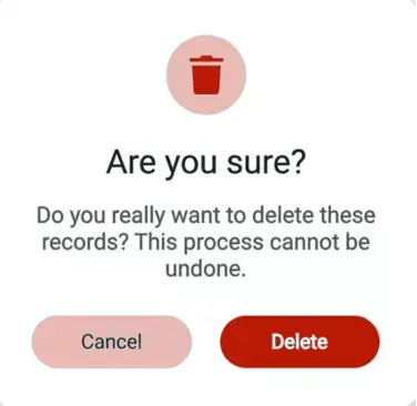
A Delete message with a ‘Cancel’ and a ‘Delete’ button in a monochromatic theme. The two shades of red are strikingly different, and the text colours are different within each button.
2. Text Sizing
Text sizing may seem mundane but can make a world of difference for visually impaired users. Which of these font sizes would you expect to be a header on a webpage? What size would you expect the body text to be?
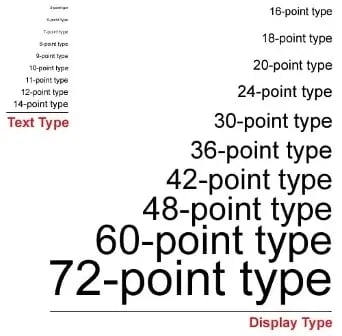
A chart displaying multiple text sizes in the same font. There are two sections: one with text type size (smaller) and one with display type size (larger)
3. Simply Iconography
Icons can be used to tell a story within design but can also assist in being visual aids to visually or cognitively impaired viewers. They can be found within an icon group or on their own. Icons look best on webpages when they are from the same icon group as they provide a sense of consistency. Are there any icons from this assortment that would not go well with each other?
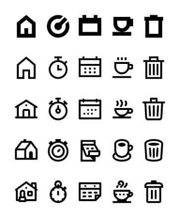
A set of icons (House, clock, calendar, cup, trash) in varying styles.
4. Visually Impaired Tech
For individuals who are blind, technology can be adapted to fit their needs. Many designs have incorporated the ability to convert voice to text and braille add-ons. How does this design incorporate technology for the visually impaired?
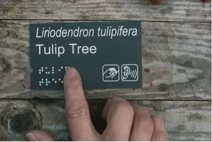
A public sign with both text and Braille.
5.Photosensitive Awareness
Flashy elements can make design inaccessible to photosensitive individuals. While this element may bring a lot of emphasis to your work, it can also create a barrier for individuals negatively impacted by flash. If there are flashy elements or pop-ups within the design, this must be labelled beforehand.
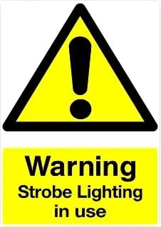
A sign advising photosensitive individuals that strobe lights are present. The sign is very bright to indicate to viewers that they may need to be advised before interacting with the design.
6. Language
Wording can be a barrier to accessibility. Look at this error message. How long would it take you as a user to understand what is trying to be conveyed? How could it be further simplified?
A complex error message pop-up. The error is not obvious to the user upon first glance.
7. Visual Hierarchy
It can be difficult to navigate a webpage when you are unsure of the order of information. Having a clear visual hierarchy can allow for users to have a better experience with less complexity to sort through.
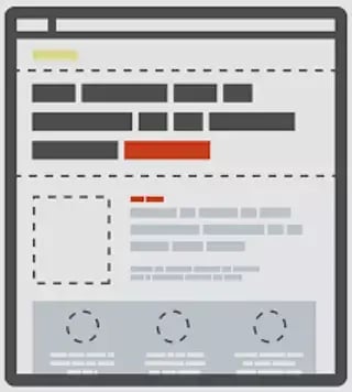
A diagram of visual hierarchy on a page layout.
Empathy in Design
Accessible design is easy to spot when you ask yourself the following:
"Who will this benefit, and how?"
We don't often notice accessible design if we are not the target audience. This is where empathy comes into the mix. If you think for a moment about who the design was made for, you can further pinpoint that group's specific needs.
Inaccessible design can be spotted just as easily. When looking at a design you suspect may provide accessibility issues, ask yourself the following:
"Who is unable to benefit from this, and why?"
A sign may be clear to you, but this does not mean you are the only intended audience. Take a closer look and try to determine the limitations of the design. Now that we have listed some of the factors that make design accessible, here is a list of criteria that can be used to determine accessibility
- Does anything stand out too harshly or blend into the background altogether?
- Is it confusing to understand the visual hierarchy?
- Is the design overwhelming to look at?
- Does the text sizing hinder my ability to understand the material?
- Do the icons convey an accurate message that could be understood without text present?
- To what capacity would a visually impaired individual be able to engage with this design?
- Would a neurodiverse user be comfortable engaging with this?
- Would photosensitive viewers feel safe engaging with this?
- Would a colourblind individual be able to view this design?
- Would younger/older individuals be able to understand this design?
Universal Design And Its Principles
One mistake that designers often make is focusing their efforts on universal design while forgetting entirely about incorporating accessibility within their work.
Universal Design refers to the process of creating and structuring an environment in such a way that it allows for the greatest possible access, comprehension, and utilization by people of all abilities. While accessible design is focused on the specific needs of people with disabilities, Universal Design considers human abilities to exist on a spectrum, with the goal of catering to the needs of the broadest range of individuals possible. Unfortunately, this can result in certain groups with special needs to be overlooked.
Universal design consists of designing for the "average" person. The downside is that the "average" person is not always expected to have special needs. While not every user may have a barrier to accessing information, failing to consider the ones that is a critical mistake in design.
While universal design may sometimes consider the special needs of the few, its primary focus is on the needs of the many. This is not the case with accessible design.
SAP And Accessibility
SAP Fiori is designed with accessibility in mind: both at the framework level and the app level. The following are elements within SAP that focus on accessibility.
- SAP allows for an accessibility mode to be enabled within certain themes (Quartz/Quartz Dark, Belize, SAP Signature, SAP Classic) for visually impaired individuals. This mode allows for a screen reader to easily process the elements onscreen.
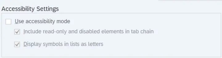
The Accessibility Mode settings in SAP.
SAP Fiori's default theme is designed to fulfill the requirements for minimum colour contrast. In addition to this, there are high-contrast themes that can be chosen in the user settings. 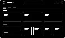
One of SAP Fiori's high-contrast themes.
- Icons within SAP are consistent across products. The icon library includes predefined descriptions. This allows for development teams to implement descriptions for tooltips as a text alternative for graphical representation.
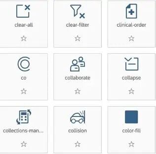
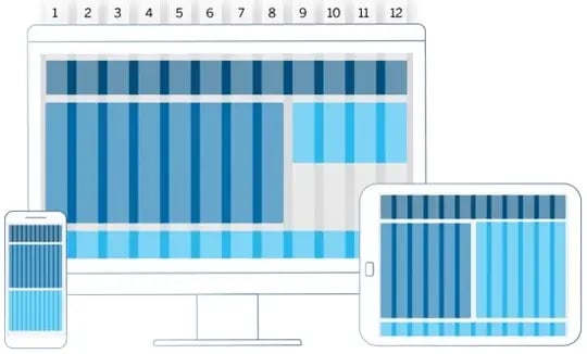
A group of SAP icons. - SAP Fiori is designed to function on a variety of devices, featuring a responsive layout that dynamically adjusts to the unique display resolution of each device. This allows users to resize the application to suit their individual requirements. Additionally, the responsive layout can automatically adapt to any font size adjustments made by the user.
- All standard UI elements and controls are designed to be keyboard-enabled.
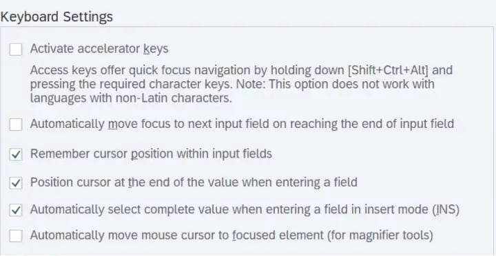
The keyboard settings menu in SAP. - There are standard messages enabled at predefined locations on the page with a consistent design.
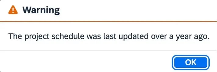
A simple warning message in SAP. - The SAPUI5 framework is equipped to provide support for screen readers by providing all necessary structural information and text to assistive technology. There are extensions that allow for seamless SAP use within screen reader software.
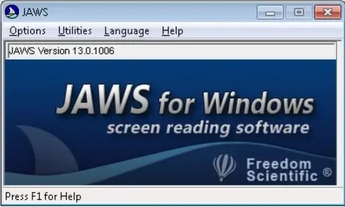
A pop-up for the JAWS screen reading software. SAP for a screen reader. can be enabled through this.
Accessible design is just one piece of a larger design thinking process. Download our full guide below.