.svg)

Mobilizing Your Business
The proliferation of compact, reliable mobile devices and networks has opened an exciting range of possibilities in the business world. Gone are the days where you were reliant on the files in your briefcase or tethered to your chunky desktop computer for access to information. Through Fiori apps accessed via smartphones and tablets, business users can now leverage the power of their SAP system from anywhere – whether they’re approving urgent requests from the airport or performing maintenance on remote assets in the field.
Mobile Design Challenges
Unfortunately, the smaller, vertically oriented screens on these devices present design challenges, especially for complex business apps. Without special modifications, content that could be easily viewed on a desktop or laptop screen would be completely unusable on a smartphone.
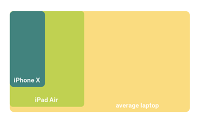
How the screen resolutions of three common devices stack up.
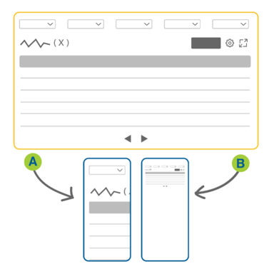
Without intervention, a desktop app viewed on a mobile device would be either A) cut off so that you can never see the full picture or B) scaled down to an unreadable size.
It’s not enough to design for any specific device model: constantly evolving hardware means that the targets are always moving (think about the jump in screen size from iPhone 8 to iPhone X, for example). Model-specific designs paint you into a corner – we want to ensure that your app investment lasts longer than a hardware cycle.
Furthermore, mobile devices are touch-based: instead of a mouse or keyboard, we usually use our fingers to navigate them. Fingers are both considerably larger and less accurate than mouse cursors (let’s be honest – we’ve all fat-fingered the wrong button on our phone before). We also lose the ability to hover and right-click, which is often used in desktop applications to bring up additional contextual information.
Given these inherent constraints, the design of a mobile app is never going to be exactly the same as the desktop version. In fact, you wouldn’t want it to be – what works well on a mobile touchscreen device is not optimal for a large desktop monitor and vice versa.
Nevertheless, the overall experience can be made consistent and cohesive across devices. It just means we have to be even more precise about how we fill the limited real estate of smaller screens to provide a good user experience. There are two main techniques for achieving this: responsive design and adaptive design.
Responsive Design
In responsive design, content is dynamically re-arranged to fit the browser window. The content is like water poured into a vase; it flows to fill the available space.
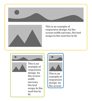 To see this in action, try resizing your browser window. As you decrease the width, you’ll notice that larger, static elements like photos will automatically shrink to preserve the layout. Text, meanwhile, will start wrapping to the next line so that each line contains fewer and fewer words. White space at the margins of the page and between elements will gradually decrease as well. At a certain width – to prevent tiny photos and choppy text lines – elements that were beside each other will wrap so that one is positioned under the other. Now there is only one column of content that takes the full width of the browser. Nothing is cut off or truncated, so the page expands longer and longer to accommodate all the content.
Responsive design allows websites and apps to adjust their layout for whatever space is available. The content itself stays the same, but the arrangement and width of each element is changed so that it looks good on any size screen. This happens automatically; on load, the system checks the browser width and presents the ideal arrangement, whether you are on a desktop computer or a smartphone.
Adaptive Design
Adaptive design handles variable screen sizes by having multiple fixed layouts. Three different layouts optimized for different ranges of screen sizes (called form factors) is common: one for smartphones (small), one for tablets (medium), and one for desktops (large). On load, the system checks the browser width and chooses the most suitable of the fixed layouts. Resizing the browser after load has no impact on the design.
While the adaptive design is less fluid than responsive design, its major advantage is that designers and developers can manually tailor each layout so that it is optimized for its form factor, rather than leaving it up to the code to determine how to re-arrange the existing content.

Adaptive design versus responsive design. Sometimes responsive design alone does not provide a great experience.
Sometimes this means swapping out controls that work well on desktop but aren’t as good on mobile. An example of this is the “hamburger” menu that often replaces the horizontal navigation bar on mobile. On desktop, it’s fine to have a list of major pages or categories along the top of the screen. On mobile, this can quickly become overwhelming when responsive design is used alone. As the buttons wrap, they can easily fill the whole screen so that the user sees nothing but a list of links. That’s why we switch out the horizontal menu for a compact hamburger menu on smaller form factors; the navigation is still easily accessible when needed, but it does not clutter the limited screen space.
Adaptive design also allows us to adjust the complexity of the app according to the device’s use cases. For example, you would probably prefer to enter large amounts of data on a desktop to take advantage of the large screen, mouse, and physical keyboard. Given the constraints of the device’s capabilities and its small touchscreen, you may want to merely view or enter a small subset of information from your smartphone. Simplicity is especially critical to a good user experience on a mobile device. As the form factors get progressively bigger and the devices more powerful, adaptive design gives us the flexibility to layer in additional functionality.
The SAP Fiori Approach
Both responsive and adaptive design have advantages, so the gold standard is to combine these methods. It works like this: create adaptive designs for a few key form factors, and handle small variations within the form factors with responsive design.
SAP Fiori has the built-in benefits of being both responsive and adaptive, meaning that, in most cases, you only have to develop, configure, and maintain an application once to provide a good experience across all devices.
At ConvergentIS, our designers and developers will help you determine the right combination of adaptive and responsive design methods to truly optimize your applications and user experiences across devices.
Pick The Right Use Case
The first step is to determine what the key use cases are and which devices support them. Some use cases are more effective in mobile applications than others. For example, workflow approvals are well-suited to mobile devices because they greatly benefit from timely responses and are often relatively simple to complete without needing to access or enter a lot of information. Another great example is field data entry: rather than having to write information down and later transcribe it into the system, field workers can update SAP directly from the workface – saving time and errors.
However, we do not recommend mobile applications for all use cases. The more complicated and data-heavy the process is, the less likely your users are going to enjoy using a smartphone to do it. Any gains in flexibility would be offset by poor user experience and uptake.
Mobile First
Once we’ve determined that your use case is a good candidate for a mobile app, we start by designing the mobile version first. The limited screen real estate forces us to focus on the crucial information and make tough decisions about what functionality to include. Usually this means reducing the amount of information in tables, breaking up complex processes into several screens, and taking advantage of the device’s other capabilities like the camera and Bluetooth.
This way, we can ensure that the core user experience is good before adding anything else for larger form factors. It’s much easier to add nice-to-have features onto a restrained mobile design than it is to try to pare down a desktop app. Once the design for the smallest form factor is complete, we continue optimizing the user experience for each progressively larger form factor – adding to the design, if necessary.
SAP Fiori has different versions of each control and layout that are optimized for each form factor. For example, buttons meant for small screens are larger and have more padding around them to prevent wrong clicks. As the screens become bigger, the spacing and text become smaller, allowing more and more content to fit onscreen. In the development phase, our developers ensure the right versions are being displayed at any given time.
Designed Smart
At ConvergentIS, we’re excited about the productivity and user experience gains that mobile SAP applications can provide your business. We use all the tools and methods available to ensure that our applications offer a consistent, “right-sized” experience across all screen sizes and devices. When we free users from their reliance on desktop computers, we empower them to work how and where they want.
To learn more about ConvergentIS Design Thinking services and what this looks like in practice, we encourage you to download a free personal copy of our Ultimate Guide to Design Thinking.